Thoughts on the Moto G

A review of the first generation Moto G (US GSM edition)

While an astonishing number of people were busy standing in lines to get the new iPhone 6 and 6 Plus, I too decided that it was time to get a new phone. I am not too keen on Apple's products these days, and for a multitude of reasons which I won't delve into here, I much prefer Windows Phone and Android over iOS. Having used a Nokia Lumia 521 since May, I decided to purchase a first generation Moto G (the 16GB US GSM edition).

From its announcement in late 2013, I have long had interest in the Moto G. It sits snugly between the flagship Moto X and the lower end Moto E as the midrange offering in Motorola's current product line. As a person who prefers to buy my phones outright and unlocked, my main criteria for choosing a new phone was that the phone must be well built, have decent hardware specs and have an inexpensive price tag. The Moto G is that phone.

I could have purchased the Nokia Lumia 635, or I could have waited for the Lumia 735 or 830 to hit the United States. However, I really wanted to switch back to Android. Don't get me wrong, I enjoyed my time with the Lumia 521. Windows Phone is a fantastic mobile operating system. It is fast, fluid, runs well on low end hardware and is extremely easy to use. On paper, there is absolutely nothing wrong with Windows Phone, and I will still be keeping the Developer Preview software on my Lumia up to date, in order to monitor first hand the progression of the platform. However, operating system choice largely comes back to personal preference, and having used Symbian (R.I.P.), Blackberry, iOS, Android, and Windows Phone as my primary mobile OS at one point in time or another over the years, I can honestly say that I prefer Android above all the others.

Lastly, before I jump into the actual review of this device, you may be asking yourself why I purchased a first generation Moto G, instead of the second generation model, as the second generation Moto G has recently been released to much fanfare. A number of factors were involved in making this decision. The first was screen size. I have had large screen phones, such as the LG G2 with its 5.2” screen, and I have had what are now considered smaller screen phones, like the Nokia 6650, the iPhone 3GS and the Blackberry Bold 9700. The second generation Moto G has a 5” screen, while the first gen Moto G has a 4.5” display. Both devices have the same resolution. However, the pixel density on the first generation G is better (326 ppi on the first generation versus 294 ppi on the second generation). Also, I have found that a 4.5” display is not too big, but not too small. It is just right for me.

The second factor was price. The second gen Moto G (with only 8GB storage) is priced at $179 before taxes. I found my 16GB first generation G on sale at Amazon for the same price. That is 8GB more storage for the same amount of money. While I do realize that the second generation Moto G does have the capability to expand storage capacity with an SD card, my personal preference is for native storage.

The last factor was design and performance. I do not care for the design of the second generation Moto G, with its two gigantic speakers on the front of the device. I cannot articulate as to the precise reason as to why, but that design is just not visually appealing to me. I think the first gen Moto G is simply a better looking device. In terms of performance, the first and second generation Moto G both have the same internal specifications — a quad core Qualcomm MSM8226 Snapdragon 400 processor, 1GB ram, and the same Adreno 305 GPU.

You may also be asking yourself if I had given thought to operating system updates (or potentially the lack thereof) when I was making the decision to purchase the first generation Moto G, and rest assured, I heavily factored this into my decision making process. Right now, both devices run Android Kit Kat (4.4.x). The second generation ships with 4.4.4, while my first generation device is currently running 4.4.3. However, Motorola has stated that they will be updating both the first generation and second generation Moto G to Android L (5.0). As such, there is no concern with regards to updates.

Let's Talk About the Phone.
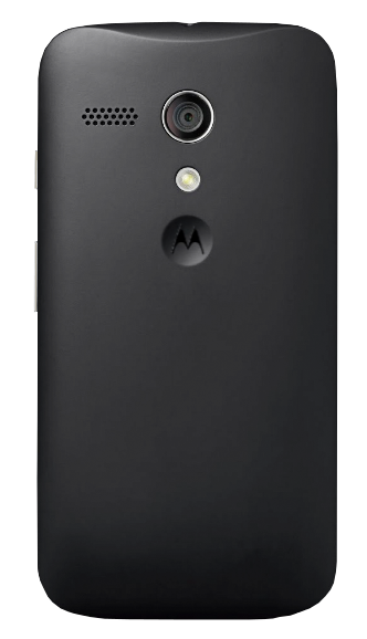
The first thing that I noticed upon unboxing the Moto G was how solid the device feels. It is not the thinnest or lightest device on the market for sure, but that is precisely what I like about it. When I was switching my SIM card from my Lumia 521 to the Moto G, I could not help but notice that the 521, which I thought was a pretty solid device, felt a bit flimsy when held side by side with the Moto G. That extra weight makes the Moto G feel like a higher end device. The velvety texture on the back of the Moto G masks the fact that the device is plastic. It almost makes it seem as if the back were made of rubber. It feels great and is easy to grip, as the phone's curved back fits nicely in my hand. I also like the little dimple with the Motorola M that is right below the camera flash.

Like the Lumia 521, the Moto G has a 5 mega-pixel camera, and photos taken by the Moto G are actually about on par with photos taken by the Lumia 521. The Moto G, in my opinion, takes slightly better (and faster) low light photos because of the flash, but honestly, neither of these two devices take particularly remarkable photos in low light in the first place. However, in well lit situations, the camera is quite good, and it serves my needs just fine. There is also a 1.3 mega pixel camera on front. I don't do selfies, but I have used it once for a Google Hangout. It works fine in good lighting, but it is nothing to write the folks back home about. The stock Motorola camera app is actually quite good, and it has modes for HDR, as well as slow motion video. I have HDR mode set to “auto”.

The phone is actually supposed to have a water resistant coating. However, I have no plans to test the water resistance of the device. The Gorilla Glass screen is bright, and the colors pop. The screen is also acceptably viewable at most angles. This display far outclasses the one on the Lumia 521. Not that the display on the 521 was bad, especially for a budget device — the screen on the Moto G is just really good.

While only 4.5 inches, as stated above, I feel that the screen is the perfect size.

On the right side of the device (when one is facing the screen) is a power button, just above the volume rocker. Both buttons are easily accessible with one hand, and both buttons have a satisfying “click” when pressed. In terms of one-handed use, the Moto G excels, although I realize that this is a fairly subjective statement. As such, I caveat my previous statement about easy one-handed use with the fact that my hands are a little above average in size. (I can easily palm a basketball.)

The Moto G has a 2,070mAh non-removable battery. One of the things that I felt Motorola should have done was allow the battery to be removed. The back cover comes off anyway, so why not have a removable battery? It should be noted that the second generation Moto G does not have a removable battery either. Aside from that little gripe, the battery will usually last about a day on a full charge. (My screen takes up the majority of my battery use, per the battery stats page in settings, and I am honestly not doing anything, like setting screen brightness to auto or using the battery saver function, which would help maximize battery life.)
Call quality and reception are very good, and as of the time of this writing, I have not yet dropped any calls. Calls are crystal clear on the receiving end, and to my knowledge, there are no issues with others being able to hear me. One issue that I always had with my Lumia 521, no matter whether I was running the T-Mobile blessed version of Windows Phone 8.0 or the latest and greatest Developer Preview edition of Windows Phone 8.1, was that from time to time, I could not make calls. I would go to place a call, and I would get an immediate error message saying that the network was unavailable. The only thing that would fix it was a reboot of the device. Fortunately, the Moto G does not have this issue, and I am inclined to think it was something with Windows Phone and/or that particular model of phone. As a note, one of my wife's friends had the Lumia 521 (with stock Windows Phone 8.0), and my son has a Lumia 521 (with 8.1 Dev Preview installed). They both experienced this issue.

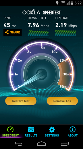
From a data connectivity perspective, the Moto G has 802.11b/g/n Wi-Fi. However, from a cellular data perspective, the Moto G only has 3G capabilities. That said, the 3G connectivity is perfectly fine for streaming music, and speed tests consistently show speeds anywhere from the 6-8 Mbps range. It should be noted that there is also an LTE model of the Moto G. When I am out and about, I pretty much only use my phone as a phone, for texting, for Instagram, for mapping, and for streaming music. As such, since the 3G model was cheaper (for more storage to boot), I opted not to get the LTE version.

Aside from the lack of a removable battery, the only other disappointment I have with the Moto G from a hardware perspective is the fact that there is no double tap the screen to wake feature. Having come from a Lumia 521 with this capability (and an LG G2 before that also had this capability), I really miss being able to tap my screen to wake the phone. However, after a few weeks use I had effectively trained my brain to no longer double tap the screen to wake it up.

Let's Talk About the Software.
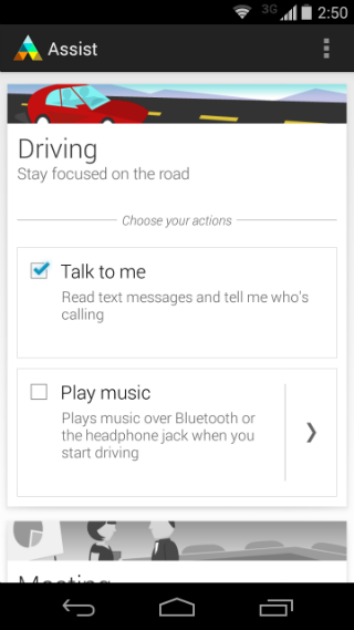
The Moto G refreshingly runs basically stock Android. There are no over the top UI skins, and there was no bloatware pre-installed. I say that this version of the Moto G basically stock Android because there are a few applications that Motorola includes that are not included in the Google Play edition Moto G (which is pure Google blessed Android). Those applications include FM Radio, Motorola Assist, Motorola Boot Services, Motorola Camera, Moto Care/Help, Motorola Connect, and Motorola Device ID. Most of the aforementioned apps are actually useful. When I initially set up my Moto G, I actually disabled the following apps: the AOSP (Android Open Source Project) calendar, the AOSP email client, and Motorola Migrate. There was nothing wrong with these apps, per se. I just knew I would not use them and did not want their services running in the background.

I am pleased so far with the overall performance of the Moto G. Because it runs basically stock Android, this phone, even with just 1GB RAM, is actually very snappy. There is no noticeable lag when navigating the UI, applications open quickly, and multi-tasking works well in the sense that you can quickly jump from one app to another without the OS saying things like, "Resuming...". (My Lumia 521, due to only having 512MB RAM, constantly had this issue, although to Microsoft's credit, the latest version of Windows Phone 8.1 Dev Preview seems to have fixed a lot of that.)
A Few Thoughts on What I Use.

Stock Android is stock Android. I don't want to say it is boring, but it is fast and lean, and unlike, for example, Samsung's TouchWiz enabled version of Android, stock Android is not filled with useless and unnecessary features. The point is, there is really only so much you can say about it. As such, I'll provide some commentary with regards to my app choices and some of the things that I have done to make the OS my own.

Currently, I am torn between the stock AOSP launcher that shipped with my Moto G versus the Google Now launcher that can be downloaded from the Play Store for any device running Android 4.1 (Jelly Bean) and up. While both launchers were made by Google, the Now launcher has a next gen sort of feel to it. I believe that a number of features in the Now launcher (if not the launcher itself) will make their way into the stock Google launcher for Android L. In fact, since the Nexus 5 ships with the Now launcher by default, it is a good bet that the Now launcher will become the standard Android launcher for the Nexus 6 and Android One devices. Interestingly enough, the Google Play version of the Moto G also ships with the AOSP launcher.

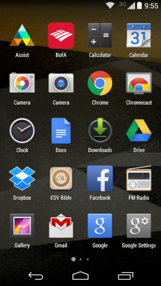
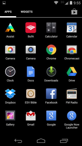
The differences in the two launchers are subtle. On the Now launcher, a swipe to the right reveals your Google Now cards, whereby on the AOSP launcher, you must swipe up from the Home button to see your Google Now cards. The app drawer buttons look slightly different, and of course, the icons on the Now launcher are larger. However, the icons appear to be scaled up, and this makes them a bit blurry. The larger, blurry icons also continue into the app drawer on the Now launcher, and instead of the black background in the app drawer on the AOSP launcher, the Now launcher contains your wallpaper.

The Google Now launcher is on the left. The AOSP launcher is on the right. As you can see, there are subtle differences between the two, most noticeably the icon sizes. I think the upscaled icons on the Google Now launcher are a bit blurry.

One of the cool things about the Now launcher is the ability to say, “OK, Google” from the home screen to search and give the phone voice commands through Google Now. However, thanks to the internal settings in the Google Now app, this functionality can be had even with the AOSP launcher. Furthermore, there are some settings that will allow you to activate voice search from the lock screen, as well as from any screen, even within apps, just by saying “OK, Google”. I have been playing with these features and using the AOSP launcher. Thus far, I have not noticed any major differences in battery life with these features enabled.

The app drawer for the Google Now launcher is on the left. The app drawer for the AOSP launcher is on the right. As you can see, there are subtle differences between the two, most noticeably the icon sizes, as well as the transparent background of the Now launcher's app drawer. I like the link to the Play Store in the upper right hand corner on the stock launcher though.

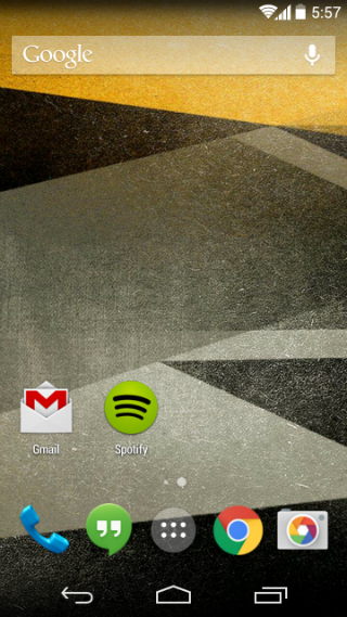
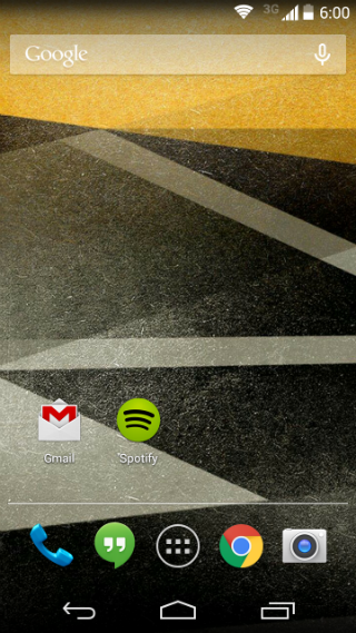
For music, I have been using the stock Google Play Music app, as well as Spotify. I have Pandora installed, but I rarely use it. Spotify is used the most, and as such, it retains a spot on my home screen.

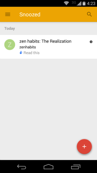
For email, I use two apps: Outlook.com and Google's new, invite only (for now) Inbox. So far, and keep in mind that I have only had this app for one day as of the time of this writing, my experience with Inbox has been fantastic, and it really appeals to me because of the way that I use email and reminders. I will be writing a lot more about this particular app at a future point in time. I will say that the folks over at Dropbox (who develop and maintain the Mailbox app) had better be really worried. Inbox does all of what Mailbox can do, and, Inbox is Google, which means that your email is no longer passing through a third-party application's servers. (I realize that email by nature is insecure and that an email makes a number of “hops” before it arrives in your inbox, but still, it is the principle of the matter.)

Text messaging is done via Google's Hangouts app. I like the new material design of the app, and the fact that Google Hangouts and texts are all in one place. However, I do not like the fact that text messages are not backed up by Google. This is one huge advantage that Microsoft has with Windows Phone, as you can elect on Windows Phone to have your texts backed up to your One Drive account. I use texting very similarly to email, and it would be nice if Google would allow texts to be automatically backed up (without the use of shoddy third-party apps) in the near future.

For photo management and backup, I am using both OneDrive and Google's Photos app. I like having them automatically backed up in both places. I also like the fact that the Google Photos app is compatible with my Chromecast. I like to use this feature when the grandparents come over.

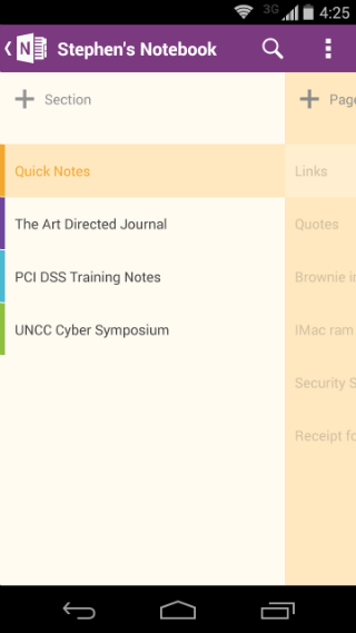
For note taking and things of that nature, I am actually using Microsoft's OneNote app. OneNote is fantastic, and at this point, I feel that it is more feature rich than Google Keep. I also like the fact that OneNote is truly cross platform at this point. My notes all sync between my Moto G, my Lumia 521, my Windows 8.1 laptop and my iMac. I also plan to do a deep dive into OneNote versus Google Keep in the near future.

A screenshot of the Inbox app is on the left. Inbox turns your GMail into a task management system of sorts. You can snooze emails to remind you to read later. Also, all your reminders made through Google Now also show up there. On the right is a screenshot of the fantastic OneNote app.

© 2011-2014 Steve Best. All Rights Reserved.