I installed the iOS 14 public beta on my first generation iPhone SE. Given the buggy nature of the iOS 13 betas last year, I figured installing the iOS 14 betas on my first generation SE would allow me to play around with iOS 14 without putting my iPhone 11 in any type of jeopardy from a reliability standpoint. I also think that it's nice that Apple is continuing to provide software updates to the first generation SE, and I was curious as to how those updates would run on an older device.
Thus far my experience with the iOS 14 betas on my first generation SE has been enjoyable, as they have proven themselves much more reliable and stable. The user interface as a whole is snappy, and, as of the time of this writing, I have experienced no lagging or crashes. Applications that gave me issues with the iOS 13 betas last year have been rock solid on the iOS 14 betas. (I’m looking at you Blackberry Work and iOS Mail.)

However, I do have one complaint. It has nothing to do with reliability and is only a personal preference issue. I do not like the App Library. In theory, the App Library is supposed to provide a solution to iPhone users that Google solved for long ago with Android — a list of all applications in alphabetical order. It would allow one to put only the few apps that they access most frequently on the first screen and then allow one to swipe left from the edge of that main homescreen to view that alphabetical list. Windows Phone (and Windows 10 Mobile) also executed this concept to perfection. However, while Apple has now decided to at least give users an alphabetical list of apps, that list is not the first thing visible when one swipes into it from the homescreen. Instead, one sees a screen full of convoluted folders that Apple has arbitrarily named and placed all apps into. While some of the folder names make sense, some of them I do not agree with.

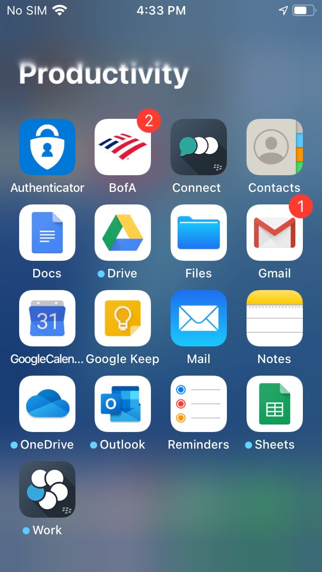
There also appears to be no way for the end user to remove or rename said folders. Examine, for example, the screenshot of my “Productivity” folder that was auto generated in the App Library. While I agree that a lot of these applications are indeed productivity apps, I would classify apps like Mail, Blackberry Connect, Outlook and Blackberry Work as apps used for communication. In fact, I have those apps in an aptly named “Communication” folder on my iPhone 11. I would also classify Files and Authenticator as utilities.
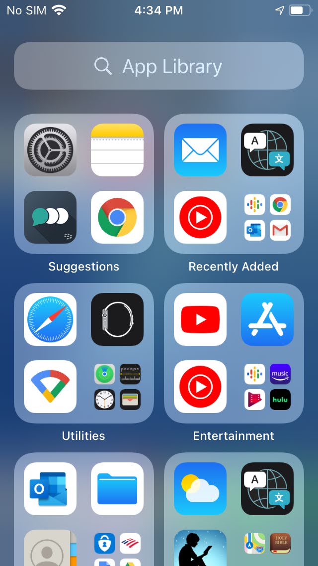
Additionally, the algorithm for the “Suggestions” folder in the App Library, as shown in the other screenshot, is interesting. I have actually not used Blackberry Connect in quite a while (months in fact). Why would this be a suggestion? I get why the “Recently Added” folder would be in the App Library. It is actually the one auto generated folder of the bunch that seems useful. However these other folders? They are just clutter.
Apple, first, if you’re reading this, thank you for your time. However, please change this. Just give the user an alphabetical list of apps and let the user control the rest. I get that you want to differ your solution from those of your competitors, but often simplicity is the best solution. The “Recently Added” folder is not a bad concept, but please either just get rid of the other folders entirely or let the user choose to remove or rename them.
Update (9/16/2020)
Subsequent beta point releases and the final GM version of iOS 14 seem to have rectified the App Library issue somewhat. For example, the “Productivity” bucket is now “Productivity & Finance”. A few weeks ago I broke down and installed iOS 14 on my iPhone 11, which I had sworn that I would not do. However, the beta point releases had proven themselves stable enough. So, it could be that I have become accustomed to the new App Library as well. I will say that overall, iOS 14 is better than iOS 13, and I am really enjoying my iPhone right now. I plan to write a future update on my home screen and the apps I am using and why, if that would be interesting to anyone.